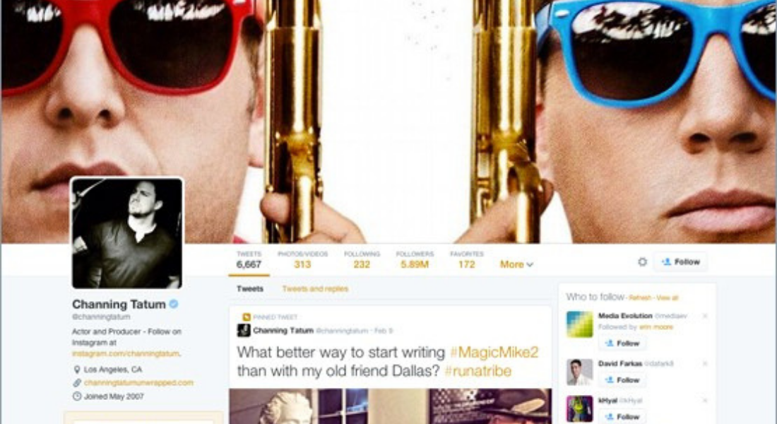
So Twitter is just rolling out a layout design, featuring larger images, pinned tweets and larger font for more popular posts to make them stand out.
Quite a few publications have referred to the new design as being more like Facebook. I doubt the Twitter chiefs decided that after all these years of running the popular platform that it should look more like Facebook.
But post-listing on the Stock Exchange both networks have been redesigned to appeal more to advertisers, essentially. Of course, they have to make a profit, but if it turns users away, then is that really the way forward?
From a personal point of view, I barely use Twitter anymore because it’s become more cluttered. I liked the original basic format, which was a stream of consciousness ranging from breaking news, random thoughts and interesting links.
The new addition of large images and different sized fonts means it’s difficult to scroll through the actual content. I find with more noise and the fight to be heard it’s much harder to use Twitter simply to get to know other people.
Many marketers and social media managers might welcome the chance to get quality content to stand out further. But should Twitter focus on providing a better platform for its business users and forget about its regular users? I don’t think so.
Share this: